Aug 20, 2026
Why Logos Look Too Small on Corporate Gifts: Print-Area Rules for Bottles, Bags and Gift Boxes
Practical print-area rules for making logos visible on bottles, tote bags, notebooks and gift boxes without weakening the overall presentation.
Why Logos Look Too Small on Corporate Gifts: Print-Area Rules for Bottles, Bags and Gift Boxes
A logo can be perfectly clear in the artwork file and still look weak on the finished gift. The usual problem is not the logo itself. It is the relationship between the available print area, the viewing distance, the product shape, the decoration method and the packaging around it.
For business buyers, “make the logo bigger” is rarely a complete solution. A logo that is too large can wrap around a bottle, disappear into the side folds of a tote bag, cross the spine of a notebook or make a gift box look like shipping material. A better brief defines where the product will be seen, which part of the identity must remain readable and how the product and packaging should share the branding work.
- Start with the visible area, not the total product size
Suppliers normally quote a maximum decoration area. That number is a production limit, not always the best visual size. A 210 × 297 mm notebook cover may allow a large print, but part of that area is visually interrupted by rounded corners, an elastic strap or the spine. A tote bag may look wide when flat, yet lose usable width when filled. A cylindrical bottle may technically accept a wrap print, but only a fraction of the artwork is visible from one angle.
Ask for two dimensions:
- the maximum technical decoration area;
- the recommended front-facing area that remains visible in normal use.
The second dimension is usually more useful for approving artwork.
- Bottles and tumblers: design for a curved viewing window
On cylindrical drinkware, the viewer rarely sees the entire circumference at once. As a practical starting point, keep the essential logo or wordmark inside the central front-facing section rather than stretching it across the full wrap area. Long horizontal logos often look smaller because they must be reduced to avoid excessive curvature.
For a tall bottle, a compact stacked logo may create stronger visibility than a long horizontal lockup. Laser engraving works well for durable, understated branding, but the final contrast depends on the coating and base metal. Screen print can offer stronger color, while full-wrap methods are useful for patterns and campaign graphics.
Before approval, request:
- a flat artwork proof with dimensions;
- a curved-product mockup;
- confirmation of the seam, handle or lid orientation;
- a physical sample when precise color or alignment matters.
See a relevant recycled drinkware option:
https://www.suoyigroup.com/products/resteel-recycled-stainless-steel-vacuum-bottle
- Tote bags: allow for folds, seams and what goes inside
The print area on a tote bag changes when the bag is carried. Side gussets expand, the center can crease and the contents can distort the fabric. Keep small text away from seams and avoid placing the key part of a logo too close to the bottom, where it may fold under when the bag is set down.
For event use, consider the normal viewing distance. A bag carried through an exhibition hall should communicate the brand from farther away than a pouch inside an employee welcome kit. A simplified mark or short campaign line will usually outperform a paragraph of copy.
Canvas, cotton and rPET felt also behave differently. Fine lines may reproduce cleanly on a smooth fabric but soften on coarse canvas or textured felt. Ask the supplier for the minimum recommended line thickness for the chosen method instead of relying only on the digital mockup.
- Notebooks: balance the logo with the cover material
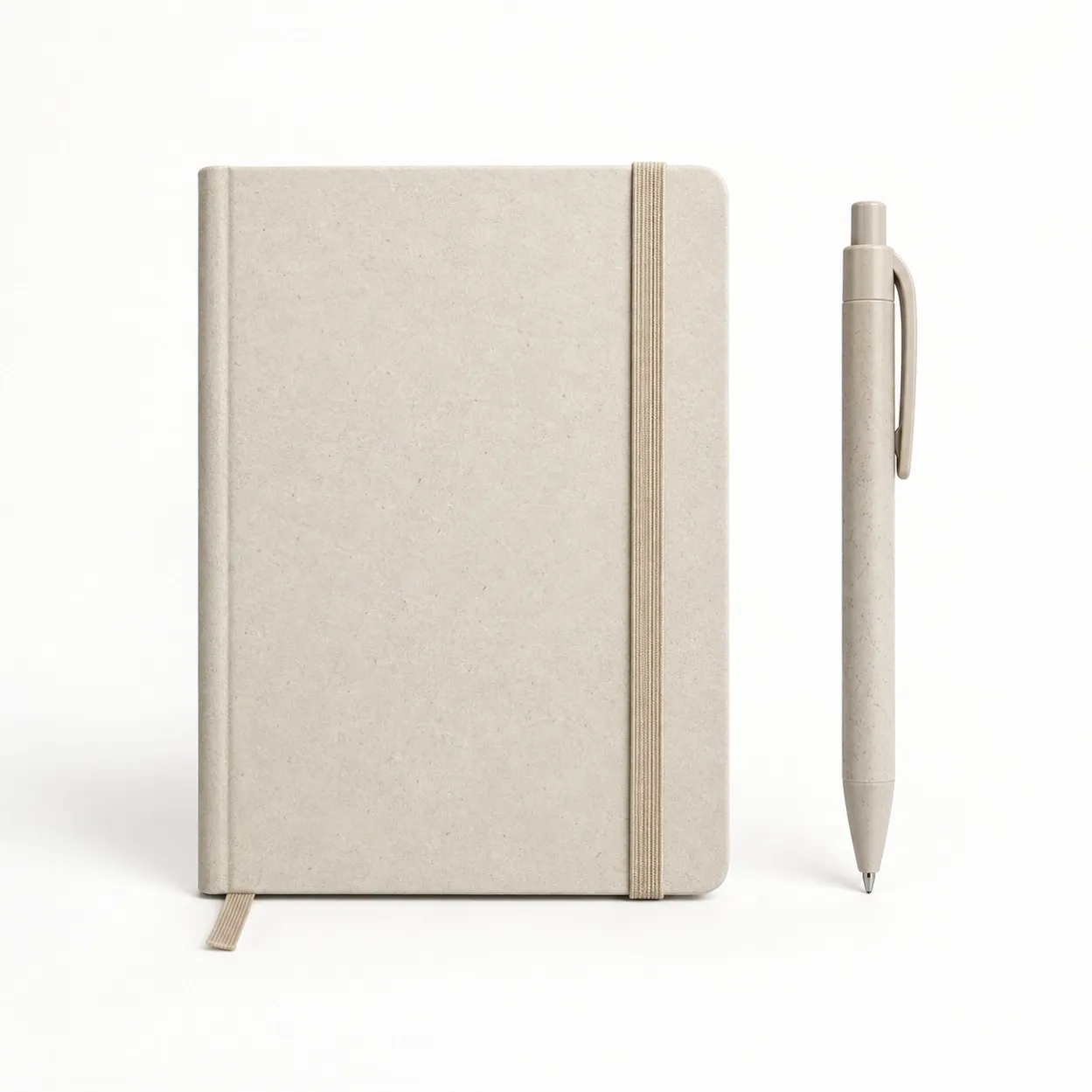
A notebook is viewed at close range, so the logo does not need to dominate the entire cover. A smaller debossed or laser-engraved mark can feel more considered than a large high-contrast print, especially on cork, recycled leather or textured paper.
The safe area should account for the spine, elastic closure, pen loop and rounded corners. If the notebook will be packed with a pen or card, review the complete set together. The best logo position on an individual notebook may not be the best position once it sits inside a presentation box.
See the cork and recycled-paper notebook:
https://www.suoyigroup.com/products/corkbound-executive-recycled-paper-notebook
- Gift boxes: use a hierarchy instead of repeating the same logo
When a product, sleeve, card and outer box all carry the same large logo, the result can feel repetitive. Assign each layer a job:
- outer shipping carton: identification and handling information;
- presentation box or sleeve: primary brand impression;
- product: durable, everyday brand reminder;
- insert card: campaign message, instructions or sustainability information.
This hierarchy often improves presentation while reducing unnecessary print coverage. It also gives buyers flexibility when one product is used across several campaigns: the item can carry a permanent corporate mark while the sleeve or card changes by event.
- A practical sizing test before production
Do not approve artwork only by zooming in on a PDF. Print the proof at 100 percent scale, cut out the logo area and place it on a similar product or box. Then check it from the likely viewing distance.
Use three questions:
- Can the main brand name be recognized immediately?
- Are small letters, trademark symbols and fine lines still clear?
- Does the logo feel intentional rather than simply filling available space?
For event merchandise, step back two or three meters. For a notebook or executive gift, judge it at desk distance. For packaging, photograph the mockup as it will appear when opened. These simple tests reveal proportion problems that a full-screen proof can hide.
- Artwork details that prevent late revisions
Send vector artwork whenever possible, with fonts converted to outlines. State the required brand color system and whether the supplier should match Pantone, CMYK or a physical reference. If the logo has a small tagline, provide an approved version without the tagline for limited print areas.
Prepare these files before requesting a quote:
- primary horizontal logo;
- compact or stacked logo;
- one-color positive version;
- reversed version for dark surfaces;
- Pantone or approved color references;
- minimum-size or clear-space rules, if available.
Our related artwork preparation guide:
https://www.suoyigroup.com/posts/prepare-logo-artwork-promotional-products
- What to include in the supplier brief
A useful branding brief should identify the product, quantity, destination, required delivery date, logo version, preferred method and packaging expectations. It should also state the purpose of the gift. A bottle for an outdoor event has different visibility requirements from a notebook in an executive welcome pack.
Ask the supplier to show:
- product dimensions and recommended decoration area;
- artwork size in millimeters;
- decoration method and number of colors;
- logo orientation relative to handles, lids or openings;
- packaging layout;
- sample and mass-production approval stages.
The goal is not the largest possible logo. It is a brand mark that remains clear, properly positioned and appropriate to the gift.
Send your product, quantity, logo and delivery requirements:
https://www.suoyigroup.com/contact-us#contact
Final approval checklist
Before production, confirm the product color, logo version, artwork size, placement, method, packaging hierarchy and proof orientation. Review the product and packaging as one system. When these decisions are made together, even a relatively small logo can create a stronger and more professional brand impression than an oversized mark placed without context.