Sep 10, 2026
Approving Logos on 200 Promotional Gifts: A Print Position, Color and Packaging Checklist
A practical approval workflow for 200 branded gifts, covering artwork files, logo size, print position, color matching, packaging visibility, samples and inspection.
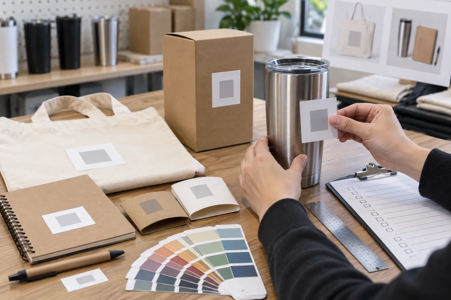
A logo can look correct on a digital mock-up and still disappoint when the finished promotional gifts arrive. The problem is usually not that the supplier ignored the artwork. It is that the approval did not define enough: the exact logo size, its position relative to seams or curves, the printing method, the colour reference and how the product will appear inside the package.
This guide uses a realistic order of 200 promotional gifts to show how a buyer can approve branding and packaging with fewer assumptions and fewer last-minute corrections.
- Prepare the correct artwork package
Send vector artwork whenever possible. AI, EPS, PDF or SVG files generally give the production team clean paths for printing, engraving or embroidery. A small JPG copied from a website may look acceptable on screen but produce rough edges when enlarged.
The artwork package should contain:
• the final approved logo
• the correct colour version and a one-colour version
• Pantone, CMYK or other agreed colour references
• minimum clear space around the logo
• any restriction on changing proportions
• the buyer’s contact person for artwork approval
Name the final file clearly. “Logo-final-approved-September” is safer than several files called “new logo” or “final 2.” If the logo includes a trademark symbol or small text, ask whether those details will remain legible at the proposed size.
- Approve dimensions, not only appearance
A mock-up should state the logo width and height in millimetres. “Large logo” is not a production instruction.
On a 200-piece order, ask the supplier to confirm:
• product dimensions
• maximum printable area
• approved logo width and height
• distance from the nearest edge, seam, zipper or handle
• orientation when the product is used
• whether the artwork is centred visually or mathematically
Visual centring matters on objects with handles, lids or curved surfaces. A logo can be mathematically centred but appear off-balance when the product is held.
For a tote bag, check whether the print sits below the handle stitching. For a tumbler, specify whether the logo faces the user or faces outward when held in the right hand. For a notebook, confirm the distance from the spine and elastic band.
- Match the decoration method to the material
The same artwork behaves differently across metal, fabric, plastic, cork and paper.
Screen printing works well for simple solid colours and larger quantities. Pad printing can suit smaller or curved items. Laser engraving exposes or changes the surface rather than adding ink, so the result depends on the product coating and base material. Embroidery adds texture but may require thicker lines and simplified small details. Digital printing supports more colours, but the final appearance still depends on surface colour and texture.
Ask for a method-specific proof. A laser-engraving preview should not be approved as if it were a full-colour print. An embroidered logo should include a stitch simulation or physical sample when fine detail matters.
Relevant product examples:
- Define colour expectations before sampling
A screen displays light, while ink and materials reflect light. This is why a digital colour match is only a reference.
For important brand colours, provide a recognised colour code and state the acceptable tolerance. Also confirm whether the product colour changes the appearance of the print. White ink on a dark bottle may require an underbase. A light logo printed on natural cotton may look warmer than the same logo on white polyester.
For a mixed gift set, review all components together. A blue logo on a bottle, notebook and tote may not look identical because each material absorbs or reflects colour differently. The goal should be a coordinated result, not an unrealistic promise that every surface will look exactly the same.
- Check how the logo appears after packaging
Brand visibility should be reviewed in the actual unboxing sequence.
Ask these questions:
• Is the logo visible when the box is first opened?
• Does a paper sleeve, strap or insert cover the decoration?
• Is the product facing the correct direction?
• Can items move during shipping and arrive upside down?
• Does the packaging label compete with the main logo?
• Is the gift message easy to find?
• Are supplier details or wholesale prices removed?
For a gift box, approve one fully packed sample—not only separate photos of the product and empty box. The completed sample reveals whether inserts fit, cards bend, lids close properly and the branding feels consistent.
- Use a three-stage approval process
A reliable approval sequence for 200 units is:
Stage 1 — Digital proof
Confirm the exact product, colour, branding method, logo dimensions and position. Mark the proof with a date and version number.
Stage 2 — Physical sample
Check actual colour, clarity, placement, surface finish and packaging fit. Photograph the approved sample under neutral light and record any accepted difference.
Stage 3 — Pre-production or first-unit check
Before the full order is completed, compare the first branded unit with the signed sample. This is especially useful when several factories or decoration processes are involved.
The buyer should nominate one authorised approver. Conflicting instructions from marketing, sales and procurement can delay production or create responsibility gaps.
- Turn approval points into an inspection checklist
The final quality check should repeat the approved measurements and appearance standards.
For the 200-piece example, an inspection sheet can include:
• correct product model and colour
• quantity and spare quantity
• logo width and height
• logo position tolerance
• print colour reference
• scratches, stains, missing print or blurred edges
• packaging orientation
• correct card, label and barcode
• carton count and shipping marks
Define how many units will be checked and what happens if a defect is found. Do not rely only on the phrase “strict quality control.” A measurable checklist gives the supplier and buyer the same decision rules.
- Control changes after approval
After the buyer signs the proof or sample, any change should be recorded with its effect on price and lead time. Moving a logo, changing a colour or replacing a box can require new tooling, screens or samples.
Use a simple change record:
Change requested | Requested by | Date | Cost effect | Delivery effect | New approval version
This prevents informal messages from being treated as final instructions and helps explain why a delivery date changed.
Key takeaways
• Send clean vector artwork and identify the final version.
• Approve logo size and position in millimetres.
• Match the proof to the real decoration method.
• Use physical samples for important colours, materials or accounts.
• Review the product inside its final packaging.
• Nominate one authorised approver.
• Convert the signed sample into a measurable inspection checklist.
• Record every post-approval change and its delivery impact.
If you are preparing a branded promotional gift order, send us the product, quantity, logo file, target delivery date and destination. We can confirm the available decoration methods, practical logo area, sampling steps, packaging options and low-MOQ order requirements before production begins.